
Last month HRS launched a redesigned website – the first substantial redesign I’ve seen since I started using the HRS. But there are really only two substantive changes.
First, the new website now has a “Landing Page” that directs traffic from participants and researchers. I like the new page – it’s nice to see a picture of people for a survey of people. The redesign also makes it easier for participants to access relevant information.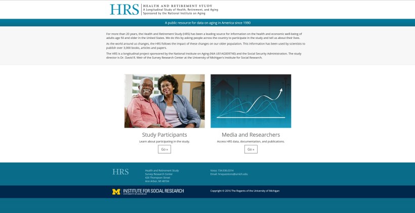
Second, the lime green and dark blue color scheme has been simplified to essentially just the blue of the “HRS” of the previous website.
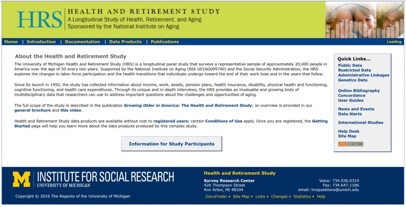
Most importantly, once you get past the landing page you arrive at the same HRS website, with everything where it was.
Although I am a big fan of the new website, including the new tag line “A public resource for data on aging in America since 1990” I used the Wayback Machine to indulge my nostalgia for the old website.
 :
:

You must be logged in to post a comment.